Introduction
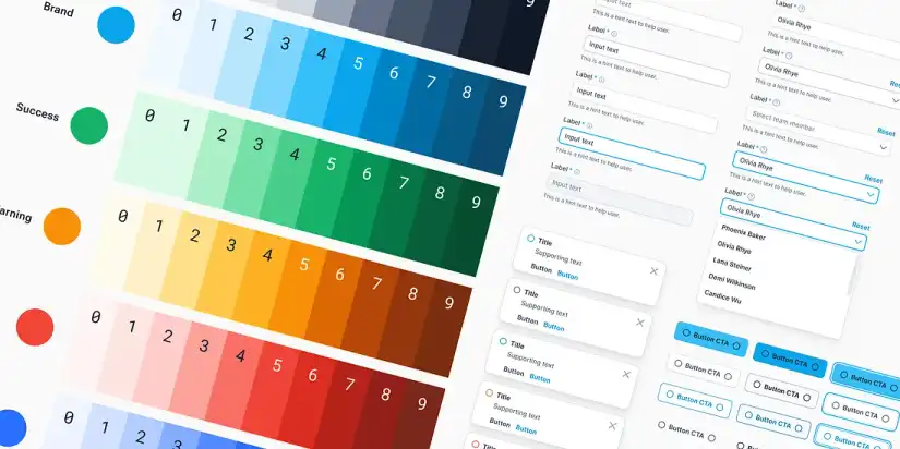
Imagine you’re designing your first app and struggling to keep all your elements consistent. This is exactly where a Figma Design System comes in. A Figma Design System is a centralized library of components, colors, typography, and layouts that ensures your app looks consistent, professional, and scalable. Whether you’re a beginner designer or part of a growing team, using a Figma Design System makes your workflow faster, reduces errors, and improves collaboration across your project.
That’s the problem Figma Design Systems solve.
A Figma Design System is like a master toolbox for all your design elements. It organizes colors, typography, buttons, input fields, icons, spacing, and components into one place so your designs are consistent, reusable, and scalable.
Whether you’re a beginner, a designer looking to improve workflow, or a product manager wanting clarity for your team, this guide will explain everything step-by-step — from scratch to advanced tips — so that by the end, you can build a professional design system in Figma.
1. What is a Figma Design System? | Build Scalable UI with Figma Components
Let’s simplify it:
Think of a design system as a recipe book for your product’s interface. Every time you need a button, a heading, or a card, you don’t invent it again — you follow the recipe.
Components of a Design System:
- Colors: Your primary, secondary, neutral, and semantic colors
- Typography: Fonts, sizes, line spacing
- Spacing: Margins, padding, grid layouts
- Components: Buttons, cards, forms, navbars
- Variants: Button states like hover, disabled, or active
- Icons: Consistent style icons
- Tokens: Values for code (colors, sizes, radius)
- Documentation: Guidelines on how to use everything
Why Figma?
Figma is online, collaborative, and beginner-friendly. Teams can share libraries, update components, and prototype without losing consistency.
2. Why Your Product Needs a Figma Design System in 2025 for Consistent UI
Here’s the simplest explanation: without a design system, your designs get messy, inconsistent, and harder to maintain.
Benefits:
- Consistency Across the Product
Every button, heading, and card looks the same. Users get a seamless experience. - Faster Design Workflows
No more recreating UI elements. Drag, drop, done! - Better Collaboration
Designers, developers, and PMs all work from the same source. - Scalability
Your app grows — your design system grows. One change in the system updates everywhere. - Reduces Mistakes
Less time correcting mismatched colors, fonts, or spacing. - Professional Results
Companies like Google, Shopify, and Uber rely on design systems because they scale beautifully.
3. Figma Design System Foundations: Colors, Typography, Spacing & Layout Grids
Before we build components, we need foundations.
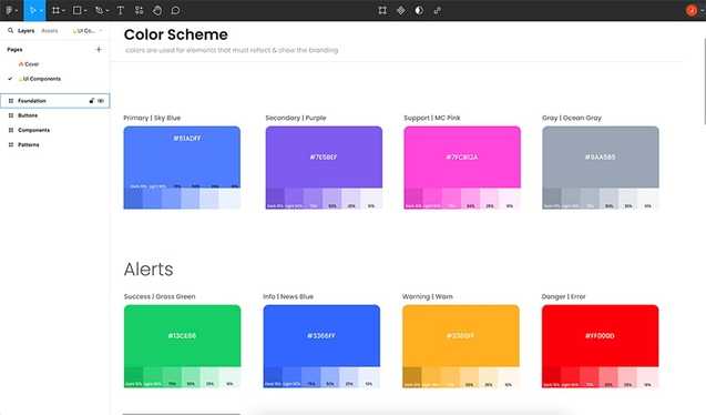
A. Color Styles
- Primary (brand identity)
- Secondary
- Neutral (grays)
- Accent
- Status colors: success, error, warning
Example:
- Primary:
#4A3AFF - Neutral/Gray 100:
#F5F5F5 - Error:
#FF4D4F
Tip: Name colors clearly: Brand / Primary / 500 not Blue-1.
B. Typography Styles in Figma Design System for Consistent Text
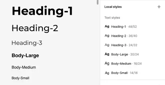
- Headings: H1 – H6
- Body text: Regular, Medium
- Buttons
- Labels / Captions
Example:
- H1: 48px Bold
- Body: 16px Regular
- Caption: 12px Regular
Tip: Stick to 2–3 font families for consistency.
C. Spacing and Grid
- Use multiples of 4px or 8px (4, 8, 12, 16…)
- Create a 12-column grid for desktop, 8 for tablet, 4 for mobile
Why it matters: Elements align perfectly, your layout feels organized.
4. Figma Components and Variants: Core Elements of Your Design System
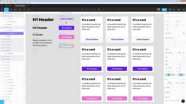
Components are reusable UI blocks. Think of them like LEGO pieces.
Common Components:
- Buttons
- Inputs / Text fields
- Cards
- Modals
- Navigation bars
- Toggles / Switches
- Dropdowns
- Alerts / Notifications
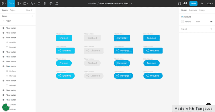
A. Buttons
Create variants:
- Primary / Secondary / Ghost
- Small / Medium / Large
- Hover / Active / Disabled
Tip: Use Auto Layout to keep buttons responsive.
B. Figma Input Field Components for Scalable Forms
Include:
- Label
- Placeholder text
- Error message
- Disabled state
Auto Layout ensures fields resize automatically.
C. Cards
Reusable for products, blogs, dashboards. Include:
- Image
- Title
- Description
- Buttons
5. Variants: One Component, Many States
Variants let you combine multiple versions of a component.
Example:Button / Primary / Small / DefaultButton / Primary / Small / HoverButton / Primary / Small / Disabled
Advantages:
- Cleaner layers
- Easier to update
- Less duplication
6. Advanced Workflows: Tokens, Auto Layout, Interactive Components
A. Design Tokens
Design tokens are variables that bridge design and code.
Example:
--color-primary: #4A3AFF;
--font-size-h1: 48px;
--border-radius-sm: 4px;
Developers use them to ensure the website/app matches the design exactly.
B. Auto Layout
Auto Layout makes components flexible.
- Adjust spacing automatically
- Resizes when content changes
- Works with buttons, cards, navbars, forms
C. Interactive Components
Prototypes come alive!
- Toggle switches
- Dropdowns
- Hover effects
- Clickable modals
7. Publishing Your Figma Design System
Steps:
- Organize components and styles
- Name everything properly
- Go to Assets → Team Library → Publish
- Share link with team
- Keep versioning (v1.0, v1.1, etc.)
8. Documentation: The Key to Usability
A system without documentation is like a map without directions.
Document:
- Component usage
- Naming conventions
- Dos and Don’ts
- Accessibility rules
- Interaction behaviors
If you’re new to UI/UX, check out our beginner-friendly UI/UX design courses to get started.”
Material Design Documentation: https://m3.material.io
9. Accessibility in 2025
Accessibility ensures everyone can use your product.
Checklist:
- Color contrast ≥ 4.5:1
- Buttons ≥ 44px tap area
- Legible fonts
- Keyboard navigation
- Alt text for images
- ARIA labels for interactive elements
Accessibility also helps SEO.
10. Maintaining Your Design System
Design systems need upkeep:
- Regular audits
- Remove duplicates
- Update naming conventions
- Fix broken tokens
- Test accessibility
11. Common Mistakes Beginners Make
- Too many components
- Bad naming conventions
- No documentation
- Ignoring accessibility
- No versioning
- Components too rigid
Tip: Start simple, improve gradually.
12. Real-World Examples
- Material Design (Google): https://m3.material.io
- Carbon Design System (IBM): https://carbondesignsystem.com
- Atlassian Design System: https://atlassian.design
Study these for inspiration.
13. Conclusion: Mastering Figma Design Systems for Scalable UI
A Figma Design System is essential for modern design in 2025. It saves time, improves collaboration, scales products, and ensures brand consistency.
By following this guide, you can create a beginner-friendly yet advanced system that grows with your product from foundations to components, variants, tokens, interactive components, documentation, and accessibility.
Start small, document everything, and gradually evolve your system. Whether you’re a beginner or intermediate designer, mastering Figma design systems is the key to professional UI/UX design.

